
Leads, conversions, and sales are the backbone of any business.
Whether you're a solopreneur, coach, blogger, small business owner, mid-sized business, or enterprise business, you can’t do business without leads. And the best way to grow your revenue is through high-converting landing pages.
The average conversion rate of a landing page is 9.7%, while the average website conversion rate is only 2.35%.
That’s a significant difference and a clear reason why you should consider using landing pages for lead generation and improving conversions.
Ready to learn the key points to a great lead gen landing page? Our guide covers everything you need to know with actionable advice you can use to improve your landing page today.
What is a Lead Generation Landing Page?
A lead gen landing page is a marketing page used to generate leads. It helps you collect the contact information (e.g., name, email address, phone number, etc.) of your potential customers.
Here is a lead generation landing page example:
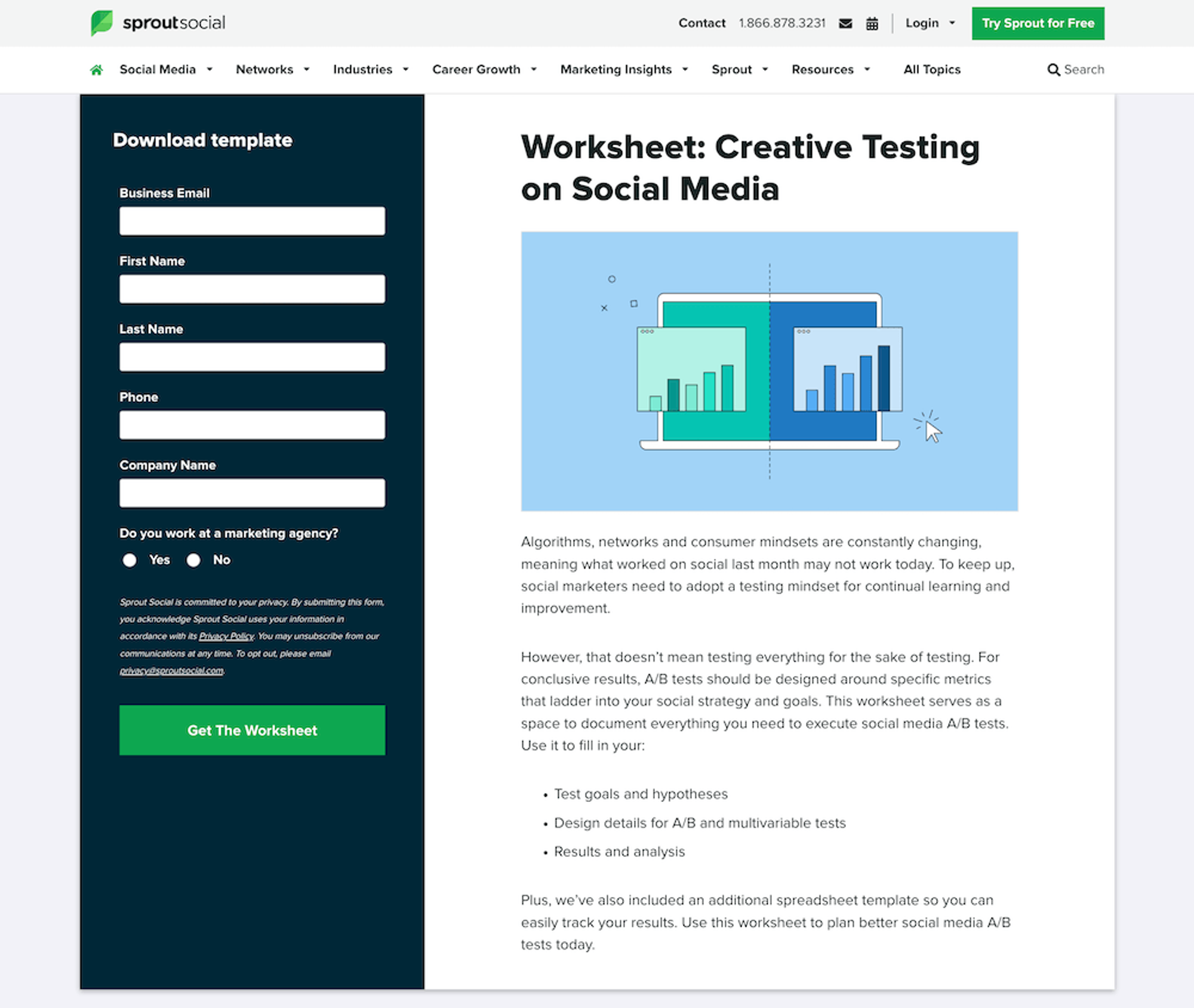
That great example from Sprout Social illustrates the concept: A lead gen landing page is used specifically to collect the personal information of your potential customers by offering them something of value in exchange.
You can send a white paper, free trial, template, checklist, PDF, or anything that is of high value to your target audience.
Once you collect the email address (and other contact information), you can proceed with the lead nurturing process through your CRM tool (CRM is short for customer relationship management).
Why Use a Landing Page?
A landing page is a unique marketing page with a sole purpose – to improve conversion rate. While your home page or the entire website is aimed at generating leads and optimizing conversion rates, landing pages are different.
Landing pages are clutter-free and highly targeted. They have a form, offer, and powerful CTA, and these elements aren’t usually found on other pages on your website.
Importantly, a landing page isn’t used to sell – its purpose is to capture personal information with a clear, singular objective. (On the other hand, the home page of your website lists multiple products and is geared towards selling instead of lead generation.)
If you are running a paid advertising campaign, you should send traffic to a landing page that’s relevant to your ad. Since landing pages are highly targeted and cover a single offer, they work best for targeted traffic to boost conversions.
Convert more leads today with an all-in-one tool for solopreneurs and small businesses: Request early access to Subkit.

How to Increase Lead Gen Landing Page Conversion Rate
Not all landing pages perform equally well. An effective and successful lead gen landing page – with an exceptionally high conversion rate – must have all the key ingredients.
Here is a list of the key elements of high converting landing pages:
- Relevancy
- Headline
- Benefits
- Image and/or video
- Form
- CTA
- Social proof
1. Relevancy
A simple rule to increase the conversion rate of your landing pages: make them relevant to the ad that led visitors to your landing page.
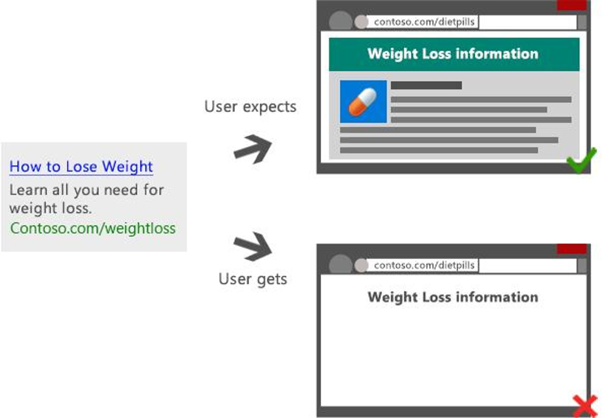
Every visitor on your landing page is driven by an ad, search query, social media post, or some other marketing channel. When a potential customer clicks a link with an expectation to solve a problem or get an offer, you need to offer the same on your landing page.
The ad, landing page, and offer – all three should be relevant and consistent, using good copy targeted at your ideal customer.
Relevance is key to boosting conversion rate.
The message should be consistent in the ad and landing page. Research shows ensuring that messages match can increase conversion rate by a whopping 212.74%.
Your lead capture form is nothing without a message match. Spend a little extra time getting the body copy right, and it will lead to conversions, referral traffic, and more.
If your landing page isn’t relevant to the source that sent the visitor, your lead capture page won’t be effective. It might get lots of traffic, but the conversion rate will be negligible.
Don’t focus on traffic or clicks, focus on conversions. Convert by making sure your landing page meets the expectations of visitors.
2. Headline
The headline is crucial to the success of a lead generation landing page. It is the initial point of contact with visitors. According to Copyblogger, 80% of visitors read the headline, while only 20% visitors read the remaining copy on a landing page.
Key takeaway: Copy needs to be more than catchy and persuasive. The headline should grab attention immediately and must hook visitors. If your headline fails to catch attention right in the first few seconds, you’ve lost potential customers.
It should also be prominent and instantly visible. Consider the content and aesthetic of the headline to make it shine.
But you don’t have to reinvent the wheel when crafting a headline for your lead generation pages. An analysis of the top 200 best ads revealed that all of them were exactly the same and used similar techniques to boost conversions.
The researchers classified the headlines of these top ads into the following five categories:
- Testimonial: Use a headline from a customer testimonial
- Value proposition: Tell potential leads how you address their issues in a unique way
- Listicle: Add a digit in the headline
- Cliffhanger: Give a short overview or teaser of what the offer is and then reveal the rest in the landing page copy
- How-to: A step-by-step actionable headline to solve a key challenge
Pick one of these headline templates and then use the following best practices for your lead capture page:
- Keep your headline specific and short. It should clearly tell the visitors what this landing page is about and what to expect.
- Use power words in your headline. Using words that trigger curiosity and evoke emotions work best as readers are more likely to connect and relate with such headlines. Some of the top power words include free, absolutely, desire, forever, miracle, trial, and endorsed – but make sure your product delivers.
- Focus on clarity. Avoid being too creative. Keep your headline as clear and understandable as possible.
- Use a number in your headline. 36% of people prefer reading and clicking a headline that has a number in it.
- Keep your headline relevant to the copy and ad. Make sure your headline and copy match visitor expectations.
3. Benefits
A powerful headline persuades the readers to keep reading and they jump to the landing page copy.
The body copy should highlight key benefits and explain why they should share their personal information and what they will get in exchange. An effective landing page should clearly state the benefits in a well-formatted layout.
The simplest way to write and list the benefits of your offer is by converting features into benefits.
Here is an example of framing a feature as a benefit:
A fingerprint sensor in mobile devices is a feature, but the ability to unlock your phone with your finger is a benefit.
Your target audience isn’t interested in reading a long list of fancy features, especially if they are technical. All they are interested in is how your offer will solve their problem. You need to explain exactly this when writing the lead gen landing page copy.
Follow these guidelines for crafting benefits for your lead generation landing page:
- List the top benefits in a bulleted form for your target audience
- Address the pain points of your target audience and tell them how your product addresses them
- Make each benefit count and clearly highlight it in terms of the value it provides – maybe that’s money or time saved
- Make your benefits stand out from the competition – tell readers why and how your offer is different and better
4. Image/Video
A landing page is incomplete without an image or a video.
Graphics give life to your landing page. Visual content helps potential leads get an idea of what to expect. And it grabs more attention.
Here’s what the research says on the importance of using visual content on a lead generation landing page:
- People remember 65% of visual content after 3 days, compared to only 10% when they hear the same information. (Brain Rules)
- The first impression of a web page is 94% design-related, which includes visual content. (ACM)
- 80% of people say they are more likely to read content that is accompanied with an attention-grabbing image. (Xerox)
- Adding a video to a landing page can increase the conversion rate by 80%. (WordStream)
- 78% of marketers reported that adding a video to landing pages increased sales. (Wyzowl)
- 92.6% of consumers say that the visual dimension is the most important factor influencing their purchase decision(a form of conversion). (Neil Patel)
- Closeup images are 24% more engaging than zoomed-out images on a lead gen landing page. (Taboola)
- Using video on a lead generation landing page increases the conversion rate by 34%. (Vidyard)
These statistics clearly show the importance of using visual content on your landing page – it’s not simply a way to improve effectiveness, you can massively impact conversion rate when you add a few key pieces into your lead generation strategy.
If you look at lead generation landing page templates from top landing page builders, you will see that the basic layout of an effective landing page always includes an image or video. Check out the following landing page templates from Unbounce, SendPulse, Shopify, and LeadPages. They all strongly recommend having an image, video, animation, or graphic above the fold.
Why?
Because visuals grab the attention of visitors and they are more likely to engage and read the copy.
To generate more qualified leads, use the following techniques to make visual content more effective:
- Add visual content above the fold so it is instantly visible to your target audience
- Add a CTA button to your video or image
- Test different types of images and videos such as animation vs. customer testimonial video and an abstract image vs. photo of a person
- Make sure all visual content is relevant to the headline and offer
- Use high quality visual content
5. Form
The form is one of the most important elements of a lead generation landing page design – it plays a crucial role in the lead generation process. It is responsible for the conversion, as the potential customers need to fill out the form to enter your conversion funnel.
Even if everything is in place on your squeeze page (another name for a landing page with a singular focus) including the headline, copy, design, and other elements, a poorly optimized form can restrict visitors from conversion. Your target audience must fill out and submit the form to become a lead. If your audience doesn’t engage with the form, your landing page won’t generate leads.
You need to make sure the form on the lead gen squeeze page has a great user experience so it isn’t ignored.
Form fields are the most important element of the conversion form directly linked with the conversion rate. Expedia lost $12 million in sales due to one additional form field.
The number of form fields isn’t the only factor that impacts the conversion rate, though.
Form placement, alignment, labeling, rules, formatting, color scheme, and validations are all key variables that impact user experience and conversion rate. It requires a lot of experimentation and A/B testing to build a high-converting form for your landing page.
While you experiment and iterate, you can use form optimization best practices that will significantly improve conversion rate, lead quality, and user experience:
- Reducing the number of form fields has been proven to increase conversions in many case studies and experiments. It’s important to avoid asking for unnecessary information – remove unwanted fields and keep the form as short as possible. If you don't need a customer’s address, don't ask.
- Highlight required form fields with an asterisk. This improves form user experience and boosts form submission rate.
- Use conditional logic to add/remove form fields as users fill them out. Remove unnecessary fields to make it easy for visitors to convert and become a lead.
- Add form validation indicating when the form has errors. This helps people fill forms quickly and accurately.
- Make the form headline a call-to-action with a power word and benefit.
- Use multi-step forms in cases where you have to get a lot of details (e.g., consulting business leads). Multi-step forms have a 300% higher conversion rate than single-step forms.
- Don’t add a captcha with your submission form as it reduces the conversion rate. One study found captchas reduce form submission by 30%.
- Move your form above the fold (top of the page) to make it instantly visible to the visitors. This helps get new leads quickly – not all visitors scroll down.
- Optimize for mobile devices and make forms responsive.
- Add a link to your privacy policy page below the form and tell them that their information is safe with you. Respect people’s personal information as if it’s your own.
- Improve the form design and layout: Make it visually pleasing with copy that’s enjoyable to read. Avoid making it a simple, old-school form with boring fields.
6. Call-to-Action
The form must be submitted by clicking or tapping the call-to-action (CTA) button. A CTA is the button or text that tells visitors what specific action they have to take next (to convert and become a lead).
Conversion happens when the CTA is clicked. A filled form without a submission won’t generate a lead.
For example, ‘click here’ is a CTA that tells visitors they should click here to proceed. A CTA button isn’t just limited to lead generation pages, but it is used throughout your website – from blog posts to web pages to the home page and all marketing campaigns. Focus on your CTAs, as they are crucial to your business success.
The whole point of using lead generation landing pages is to make visitors fill out the form and click the CTA button.
Optimizing the call-to-action button on the lead gen web page to persuade visitors to click it should be your top priority. A noticeable, prominent, and strong CTA button improves conversion rate significantly.
Here are CTA button best practices to build your email list with squeeze pages:
- Make the CTA button prominent and visually appealing.
- Add it above the fold, right below the form, so it is visible instantly.
- Use clear and consistent wording on the button. All CTA buttons on the lead generation landing page have the same design and purpose.
- Contrasting color CTAs stand out and grab attention immediately.
- Avoid basic click here and submit CTA button texts. Instead, guide visitors on what they should do and what they should expect next. For example, start your free trial, submit the registration form, get my free book, etc.
- Use action-based wording for CTA text that persuades and motivates visitors to take an action and click the button.
- Create a sense of urgency. It works. For example, get a free book today only.
- Add white space around the CTA button to highlight it and make it visible.

7. Social Proof
Social proof is a phenomenon where people imitate the behavior of others in a given situation, assuming it to be the correct behavior for that situation. In other words, people tend to do what others are doing because they think it's the right thing to do.
This psychological phenomenon is used extensively in marketing in the form of customer testimonials, reviews, expert opinions, endorsements, and several other powerful ways.
Here is an example of social proof from Casper:
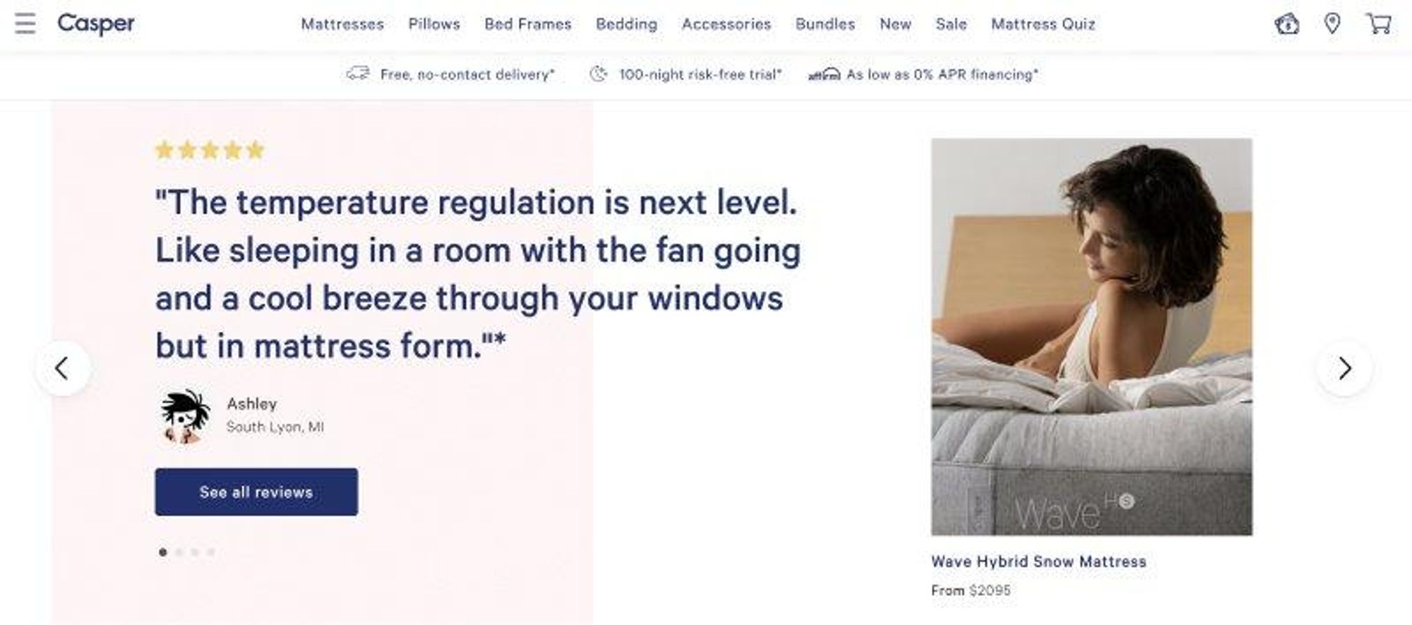
Reviews and customer testimonials tell your target audience that people love using your product, generating a sense of trust (and maybe even a little FOMO). Social proof is a great way to boost the conversion rate of any landing page.
Social proof should be a key element of a lead generation landing page:
- 88% of people trust reviews as much as personal recommendations. (HubSpot)
- 70% of people trust a recommendation from people they don’t know and 92% of people trust recommendations from peers. (Nielsen)
- 98% of people read online reviews for local businesses. (BrightLocal)
- Customer testimonials increase the conversion rate by 34%. (VWO)
- 97% of consumers reported that online reviews influence their purchase decisions. (Podium)
- 40% of people said that they have purchased a product after seeing it used by an influencer on social media. (Invesp)
Using social proof on your landing page can significantly improve conversion rate. You can choose from any type of social proof for your landing page:
- Customer reviews and testimonials are the most popular form of social proof
- Opinions from an industry expert or thought leader in your niche
- Celebrity endorsements work great as social proof (local celebrities included!)
- Influencer marketing where an influencer recommends your product or business (micro-influencers are a way to test this strategy on a budget)
- Certifications and awards are a powerful form of social proof
Lead Generation Landing Page Examples
To help you gain more insights into what makes a great lead generation landing page, we’ve compiled a list of the best lead generation campaigns.
Our top picks:
1. Wag
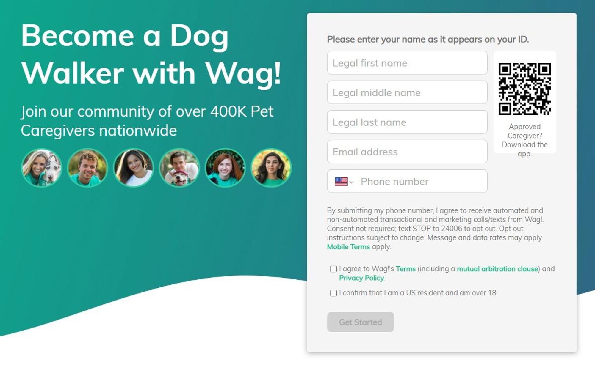
Wag has an amazing landing page that pushes visitors into the sales funnel right away. Here is what we like about it:
- Above the fold form and CTA
- Powerful headline
- Link to the privacy policy
2. TransformHQ
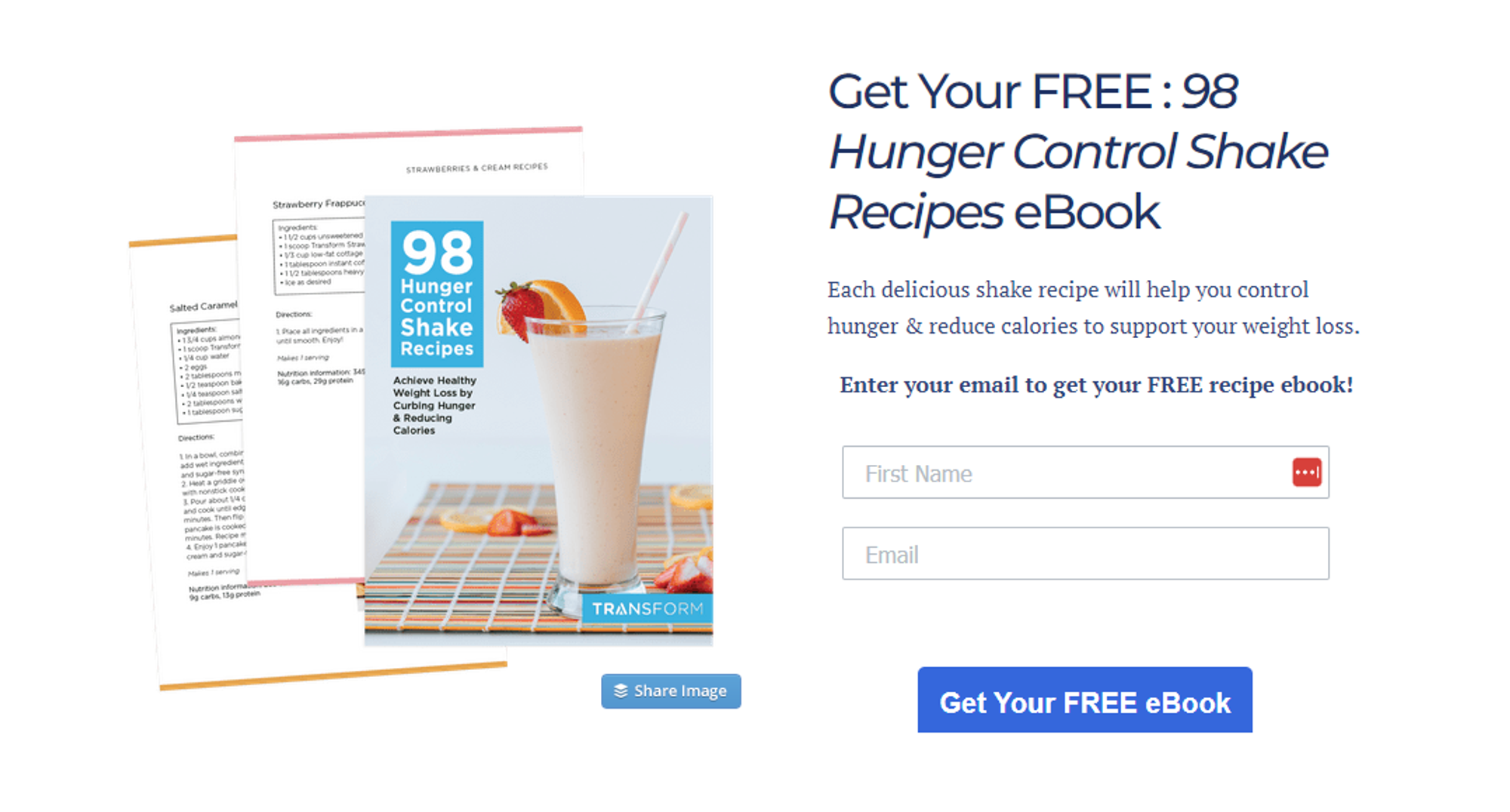
A clean and simple landing page by TransformHQ is a perfect example for small businesses with tiny sales teams to generate leads without spending heaps of money on fancy landing pages.
Here is what we love about it:
- Everything is at the top of the page
- Clear CTA that stands out from the rest of the elements
- A short form with just 2 fields
3. Codecademy

Codecademy has a simple landing page that has a lot to learn from. Here is what we like:
- Catchy and strong headline with a strong image
- A tiny form that gets the job done
- Everything is above the fold
Key Takeaways
All types of businesses, from small businesses to large corporations, require lead generation landing pages. These pages form the backbone of your business, supporting your marketing efforts across various campaigns, including email, content, PPC, and more.
To create an effective lead generation landing page, it's important to follow the best practices and guidelines we’ve outlined above.
Most important: Your headline should be clear and understandable, with visual content and copy that matches visitor expectations. It's been proven that people remember much more when they see something compared to when they hear the same information.
When created properly, the landing page just works.
If your landing page isn’t working for any reason, it’s time to test. Experiment and try to learn what your target audience loves to see on your squeeze page. Add new offers, hire out help to improve the visuals, or shoot a video to add fresh content to your page.
Constant iterations will help you significantly boost the conversion rate of any lead generation landing page you have. Each incremental improvement has the ability to make a massive impact on your business.
Start converting leads today with an all-in-one tool for solopreneurs and small businesses: Request early access to Subkit.


